Last Updated on June 20, 2023 by Mary Pressler
ERCOT Real Time System Conditions
If you live in Texas, you have most likely heard the term “ERCOT real-time system conditions” in the news. ERCOT has an online dashboard that shows exactly how the power grid is operating at any given time. The dashboard tells you the margin between the available generation capacity and consumption, the risk of rolling blackouts, and other useful information. However, the graphs and charts can be confusing at first.
Here is a guide to the ERCOT dashboard, which describes the data displayed on their website in simple terms. To open the dashboard, you can click on the following link:
https://www.ercot.com/gridmktinfo/dashboards
The ERCOT dashboard displays nine different charts:
- Supply and Demand
- Grid Conditions
- Ancillary Services
- System-Wide Demand
- Combined Wind and Solar
- Real-Time Locational Prices
- DC Tie Flows
- Weather Forecast
- System-Wide Prices
Supply and Demand Chart
This graph displays a 24-hour period, and it compares the available generation capacity with the total consumption across the ERCOT grid (hour by hour).
- The vertical gray line represents the current time. As the day passes, the vertical line moves from left to right.
- Everything to the left of the vertical line has already happened (historic data).
- Everything to the right is a forecast of how the grid will behave the rest of the day.
You will notice there are five different lines on the graph: solid purple, solid turquoise, dotted dark purple, dotted light purple, and dotted turquoise. We will start by describing the two solid lines:
The solid purple line represents the actual electricity supply available from power plants that were online at that time of the day, and also power plants that were acting as operating reserves. The official term used by ERCOT to describe this value is “Committed Capacity”.
The solid turquoise line represents the actual demand (power consumption), which is based on measured data from the entire ERCOT grid. Whenever the purple line is above the turquoise line, ERCOT can generate more than enough power for all homes and businesses. In cases where the grid operates with a tight margin between power supply and demand, you will notice that the purple and turquoise lines are very close.
To the right of the vertical gray line (current time of the day), there are three forecasts that are represented by dotted lines:
- The dotted turquoise line is the forecast demand, which can be described as the power consumption expected by ERCOT.
- The dotted dark purple line is the “forecast committed capacity”. In simple words, this is the electricity supply expected to be available from power plants online, and power plants acting as reserves. The committed capacity also includes the expected electricity output of solar and wind farms, which cannot be controlled directly because the energy inputs are variable.
- The dotted light purple line is the “forecast available capacity”. This includes power plants that would be offline under normal conditions, but are capable of going online if necessary. When these power plants are added to the “committed capacity”, you get the total available capacity.
Link: https://www.ercot.com/gridmktinfo/dashboards/supplyanddemand

ERCOT Grid Conditions Chart
Here you can check the Operating Reserves and Daily PRC displays, and we will explain what each of them means.
The Operating Reserves display shows two important pieces of information:
- How much operating reserves are available?
- What is the current grid condition? (Based on operating reserves)
The operating reserve represents generation capacity that is currently available and online, but not being used by consumers. The operating reserve can be used instantly if there is a sudden increase in electricity consumption, or a sudden decrease in generation from other power plants. This includes sudden drops in the output of solar and wind farms, which are variable by nature.
Depending on Operating Reserves available, ERCOT will display five possible grid conditions:
- GREEN: Normal
- YELLOW: Conservation Efforts in Place
- ORANGE: Emergency Level 1
- RED: Emergency Level 2
- BLACK: Emergency Level 3
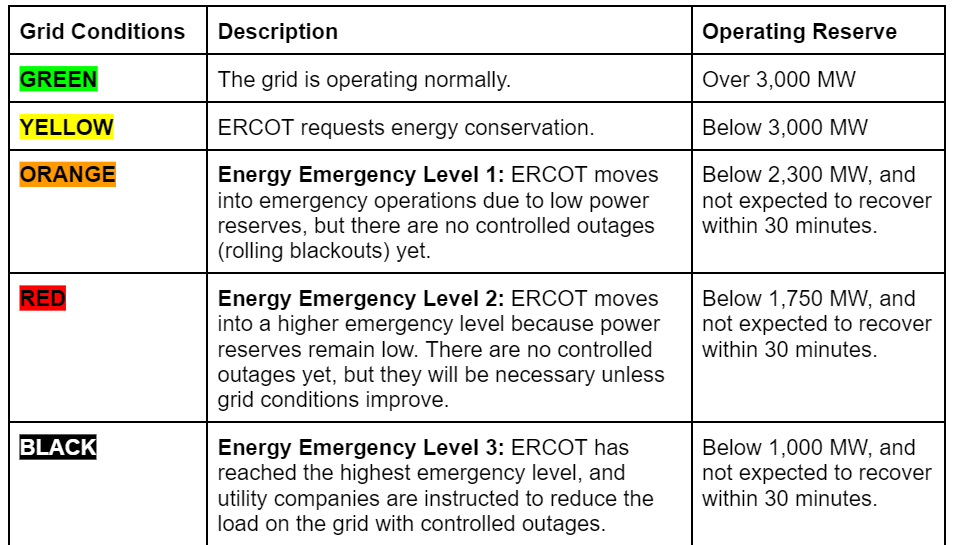
NOTE: If you live in Texas and are concerned about rolling blackouts, the Operating Reserves Chart is the most important to watch. If the operating reserves drop below 1,000MW and Energy Emergency Level 3 is reached, controlled outages are imminent.
The other display is called the Daily PRC, which stands for Daily Physical Responsive Capacity. These are the resources that can respond instantly to keep the ERCOT grid frequency at 60Hz, and the value includes both generation and load resources. For example, if a large power plant goes offline suddenly and the grid frequency drops as a result, the Daily PRC can respond instantly to raise the frequency back to 60 Hz.
Link: https://www.ercot.com/gridmktinfo/dashboards/gridconditions

Ancillary Services Chart
The ancillary services chart can seem complex, but in simple terms it summarizes the generation resources that keep the grid frequency stable at 60 Hz. You will notice that the chart displays four types of ancillary services:
- Regulation Up (REG UP)
- Regulation Down (REG DOWN)
- Responsive Reserve (RRS)
- Non-Spinning Responsive Reserve (NSRS)
The terms “Regulation Up” and “Regulation Down” refer to generation capacity and controllable load that is being used all the time to keep the grid frequency at 60 Hz.
- High frequency (over 60 Hz) can be lowered either by reducing generation or by increasing load.
- Low frequency (below 60 Hz) can be raised either by increasing generation or by decreasing load.
Responsive Reserve (RRS) and Non-Spinning Responsive Reserve (NSRS) are used to handle grid disturbances of greater magnitude, which are capable of making the voltage and frequency unstable. RRS capacity responds in less than 10 minutes, and NSRS capacity responds in less than 30 minutes.
Below the four ancillary service charts, you can see a graph of the actual grid frequency over time. You will notice how “Regulation Up” resources are used when frequency drops below 60 Hz, and “Regulation Down” resources are used when the frequency exceeds 60 Hz.
Link: https://www.ercot.com/gridmktinfo/dashboards/ancillaryservices

System-Wide Demand Chart
This chart is easy to understand. It shows the total demand on the ERCOT grid, which is measured in megawatts.
- Solid purple line: Power consumption forecast for the current day.
- Dashed purple line: Consumption forecast for the next day (Day-Ahead Forecast).
- Solid turquoise line: Actual power consumption for the current day.
If ERCOT’s forecast is accurate, the solid turquoise line (actual demand) will closely follow the solid purple line (forecast demand). If there is a notable difference between both lines, ERCOT’s demand has been overestimated (purple line above the turquoise line) or underestimated (turquoise line above the purple line).
You can visualize the three curves for the current and previous day, and also the forecast for the next day. Keep in mind that the “Day-Ahead Forecast” from the previous day becomes the “Current Forecast” for today.
Link: https://www.ercot.com/gridmktinfo/dashboards/systemwidedemand

Combined Wind and Solar Chart
This is another simple chart, which focuses on solar and wind generation in the ERCOT grid. The blue lines represent wind generation, the orange lines represent solar generation, and the purple lines represent the combined wind + solar generation. In other words, the purple line is the result of adding the blue and orange lines.
- The solid lines represent the average hourly generation, which is real data measured for the current day.
- The light dotted lines represent the generation forecast for the current day.
- The dark dotted lines represent the generation forecast for the next day.
Link: https://www.ercot.com/gridmktinfo/dashboards/combinedwindandsolar

Real-Time Locational Prices Chart
This chart shows a color map of Texas, displaying electricity prices throughout the state. Keep in mind that this map displays wholesale electricity prices per megawatt-hour, and they are updated at five-minute intervals.
These prices are different from the retail kilowatt-hour prices paid by consumers, which depend on their electricity plan of choice. However, if you have a variable-rate or indexed-rate electricity plan, high wholesale prices normally lead to high retail prices. A fixed-rate electricity plan is not affected by wholesale price variations.
Link: https://www.ercot.com/content/cdr/contours/rtmLmp.html

DC Tie Flows Chart
This chart shows electric power transmission at the four interconnections between ERCOT and neighboring grids:
- DC_E (East)
- DC_L (Laredo VFT)
- DC_N (North)
- DC_R (Railroad)
A positive number indicates that ERCOT is exporting power to the corresponding grid, while a negative number indicates that ERCOT is importing power. Like many other charts in the dashboard, the DC Tie Flows chart shows a 24-hour period.
ERCOT has limited interconnection with neighboring grids, and this has been on purpose to avoid federal regulation. This has advantages and disadvantages: Texas can make its own rules when it comes to electric power, but the amount of power that can be imported from neighboring grids during an emergency is very limited.
Link: https://www.ercot.com/gridmktinfo/dashboards/dctieflows

Texas Weather Forecast Chart
This chart provides a weather forecast for all regions covered by the ERCOT grid, and you can click on each region to display the respective temperature forecast. Below the chart, you can also find a detailed description of the current weather forecast, for today and tomorrow.
Generally, a hot summer day leads to peak demand across the ERCOT grid, since homes and businesses are using their conditioning systems at full capacity. However, high demand can also be expected during a cold winter day. According to the US Census Bureau, 61% of Texas homes use electric heating systems, compared with 39% of homes nationwide.
Link: https://www.ercot.com/gridmktinfo/dashboards/weatherforecast

System-Wide Prices Chart
This graph displays the average wholesale electricity price, across all price hubs in the ERCOT grid. The graph shows the average price by default, but you can use the drop-down menu to display specific price hubs or load zones. The solid line represents real-time prices, while the dotted line represents day-ahead prices.
As mentioned before, the wholesale electricity price is different from the actual price in your rate. However, high wholesale prices lead to high retail prices if you have a variable or indexed rate.
Link: https://www.ercot.com/gridmktinfo/dashboards/systemwideprices
 https://quickelectricity.com/wp-content/uploads/2024/07/Lubbock-Electricity-Bill-Explained-scaled.jpg
1360
2048
Mary Pressler
https://quickelectricity.com/wp-content/uploads/2021/10/Quick-Electricity-Logo--300x79.jpg
Mary Pressler2024-07-21 08:55:502024-07-23 20:14:08Your Lubbock Electricity Bill Explained
https://quickelectricity.com/wp-content/uploads/2024/07/Lubbock-Electricity-Bill-Explained-scaled.jpg
1360
2048
Mary Pressler
https://quickelectricity.com/wp-content/uploads/2021/10/Quick-Electricity-Logo--300x79.jpg
Mary Pressler2024-07-21 08:55:502024-07-23 20:14:08Your Lubbock Electricity Bill Explained https://quickelectricity.com/wp-content/uploads/2024/06/Risk-of-Energy-Emergency-Alert-with-Low-Wind-Conditions-ERCOT-Grid-Summer-2024.png
371
600
Mary Pressler
https://quickelectricity.com/wp-content/uploads/2021/10/Quick-Electricity-Logo--300x79.jpg
Mary Pressler2024-06-26 09:47:422024-06-26 09:47:42Texas Electricity Outlook Summer 2024
https://quickelectricity.com/wp-content/uploads/2024/06/Risk-of-Energy-Emergency-Alert-with-Low-Wind-Conditions-ERCOT-Grid-Summer-2024.png
371
600
Mary Pressler
https://quickelectricity.com/wp-content/uploads/2021/10/Quick-Electricity-Logo--300x79.jpg
Mary Pressler2024-06-26 09:47:422024-06-26 09:47:42Texas Electricity Outlook Summer 2024 https://quickelectricity.com/wp-content/uploads/2022/08/Texas-Electricity-Broker-.png
1080
1080
Mary Pressler
https://quickelectricity.com/wp-content/uploads/2021/10/Quick-Electricity-Logo--300x79.jpg
Mary Pressler2024-06-18 16:14:522024-06-22 08:43:08Commercial Energy Broker in Texas
https://quickelectricity.com/wp-content/uploads/2022/08/Texas-Electricity-Broker-.png
1080
1080
Mary Pressler
https://quickelectricity.com/wp-content/uploads/2021/10/Quick-Electricity-Logo--300x79.jpg
Mary Pressler2024-06-18 16:14:522024-06-22 08:43:08Commercial Energy Broker in Texas https://quickelectricity.com/wp-content/uploads/2024/05/Electricity-Options-Texas.jpg
627
1200
Kelli
https://quickelectricity.com/wp-content/uploads/2021/10/Quick-Electricity-Logo--300x79.jpg
Kelli2024-05-14 04:05:352024-05-14 04:05:35Demystifying Energy Contracts: What Texans Need to Know
https://quickelectricity.com/wp-content/uploads/2024/05/Electricity-Options-Texas.jpg
627
1200
Kelli
https://quickelectricity.com/wp-content/uploads/2021/10/Quick-Electricity-Logo--300x79.jpg
Kelli2024-05-14 04:05:352024-05-14 04:05:35Demystifying Energy Contracts: What Texans Need to Know https://quickelectricity.com/wp-content/uploads/2024/04/How-to-Cut-Monthly-Expenses.jpg
412
618
Mary Pressler
https://quickelectricity.com/wp-content/uploads/2021/10/Quick-Electricity-Logo--300x79.jpg
Mary Pressler2024-04-21 16:36:072024-04-21 16:37:27How to Cut Monthly Expenses: 9 Clever Ways to Save Money
https://quickelectricity.com/wp-content/uploads/2024/04/How-to-Cut-Monthly-Expenses.jpg
412
618
Mary Pressler
https://quickelectricity.com/wp-content/uploads/2021/10/Quick-Electricity-Logo--300x79.jpg
Mary Pressler2024-04-21 16:36:072024-04-21 16:37:27How to Cut Monthly Expenses: 9 Clever Ways to Save Money https://quickelectricity.com/wp-content/uploads/2024/03/How-to-improve-energy-efficiency-in-buildings.png
980
1470
Mary Pressler
https://quickelectricity.com/wp-content/uploads/2021/10/Quick-Electricity-Logo--300x79.jpg
Mary Pressler2024-03-08 09:33:152024-03-08 09:39:41Improving Energy Efficiency in Buildings
https://quickelectricity.com/wp-content/uploads/2024/03/How-to-improve-energy-efficiency-in-buildings.png
980
1470
Mary Pressler
https://quickelectricity.com/wp-content/uploads/2021/10/Quick-Electricity-Logo--300x79.jpg
Mary Pressler2024-03-08 09:33:152024-03-08 09:39:41Improving Energy Efficiency in Buildings https://quickelectricity.com/wp-content/uploads/2024/02/Water-Conservation-and-Energy-Efficiency.jpg
788
940
Mary Pressler
https://quickelectricity.com/wp-content/uploads/2021/10/Quick-Electricity-Logo--300x79.jpg
Mary Pressler2024-02-28 08:06:552024-03-12 09:23:09An Eco-Friendly Approach to Water Conservation
https://quickelectricity.com/wp-content/uploads/2024/02/Water-Conservation-and-Energy-Efficiency.jpg
788
940
Mary Pressler
https://quickelectricity.com/wp-content/uploads/2021/10/Quick-Electricity-Logo--300x79.jpg
Mary Pressler2024-02-28 08:06:552024-03-12 09:23:09An Eco-Friendly Approach to Water Conservation https://quickelectricity.com/wp-content/uploads/2024/02/Energy-Efficient-Home-Designs-Windows-.jpg
788
940
Mary Pressler
https://quickelectricity.com/wp-content/uploads/2021/10/Quick-Electricity-Logo--300x79.jpg
Mary Pressler2024-02-08 11:39:572024-02-08 11:44:26Designing an Energy Efficient Home in 2024
https://quickelectricity.com/wp-content/uploads/2024/02/Energy-Efficient-Home-Designs-Windows-.jpg
788
940
Mary Pressler
https://quickelectricity.com/wp-content/uploads/2021/10/Quick-Electricity-Logo--300x79.jpg
Mary Pressler2024-02-08 11:39:572024-02-08 11:44:26Designing an Energy Efficient Home in 2024